SaaS Labs (JustCall), 2025
Redesigning the cancellation flow to
reduce churn and retain revenue
Team
Design Lead
Product Designer (me)
Product manager
3 Engineers
My role
Research
Design
Dev handoff
Duration
1 month
Background
Every month, we saw around 200–300 account cancellations.
Despite users cancelling for different reasons, everyone went through the same cancellation flow.
There was no way to understand why a user was leaving or respond differently based on their situation. As a result, cancellations felt abrupt, and the team had limited clarity on what was actually driving churn.
But what is JustCall?
JustCall is a B2B SaaS communication platform that helps sales and support teams manage calls, messages, and workflows at scale across global customers.

the problem
Cancellation flow treated every user the same,
regardless of intent or value
Users cancelling for cost, low usage, product issues, or changing business needs were pushed through the same linear flow which offered no clarity, no flexibility, and no meaningful chance to intervene. As a result, we lost insight into why users churned and missed retention opportunities, especially for high-MRR accounts.
quantitative Insights
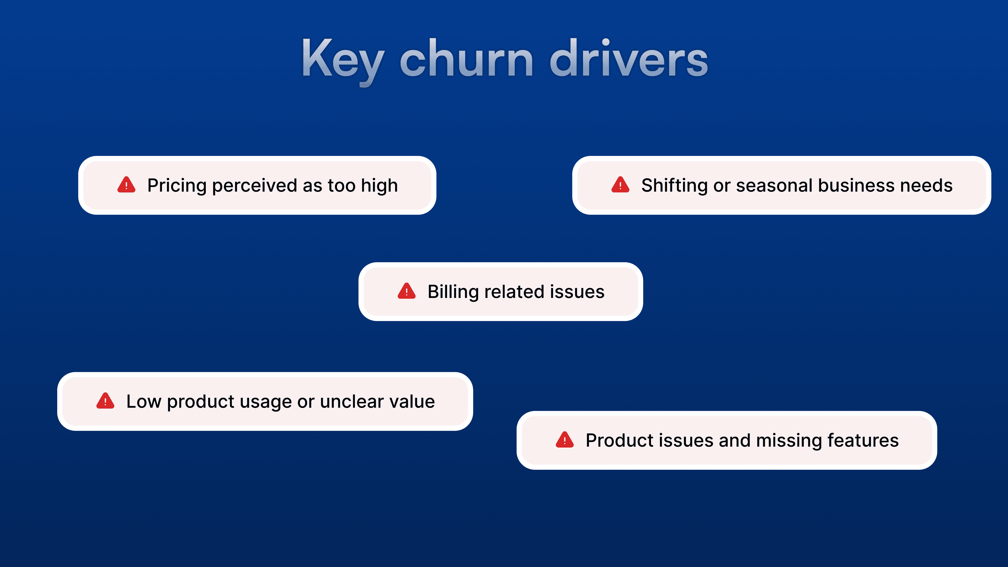
What we learned from churn data
Analyzing cancellation reasons and user remarks revealed that churn was driven by a small set of
recurring themes.
qualitative Insights
Talking to customers to understand the "Why"
While the quantitative data showed how many users were leaving, we needed to understand the underlying friction and emotions driving them to complete the cancellation.
The "Clarity Gap"
"I thought my team's phone numbers would be safely parked for a bit. If I had known that clicking cancel meant our entire global call history would be permanently deleted on day one, I would have looked for a pause option instead."
One Size Doesn't Fit All
"We love JustCall, but our sales team downsized by 40% this quarter. The software is just too expensive for our new budget right now. A generic 'pause' doesn't help because we still need to make client calls today. We just need a flexible plan."
Exit Fatigue
"The exit survey felt like an interrogation. The options were confusing and overlapping, and I had to click through screen after screen of text saying the same thing. I just wanted to get it over with."
Source: Qualitative synthesis of 50+ customer interviews, audits, historic billing complaints, and documented exit logs.
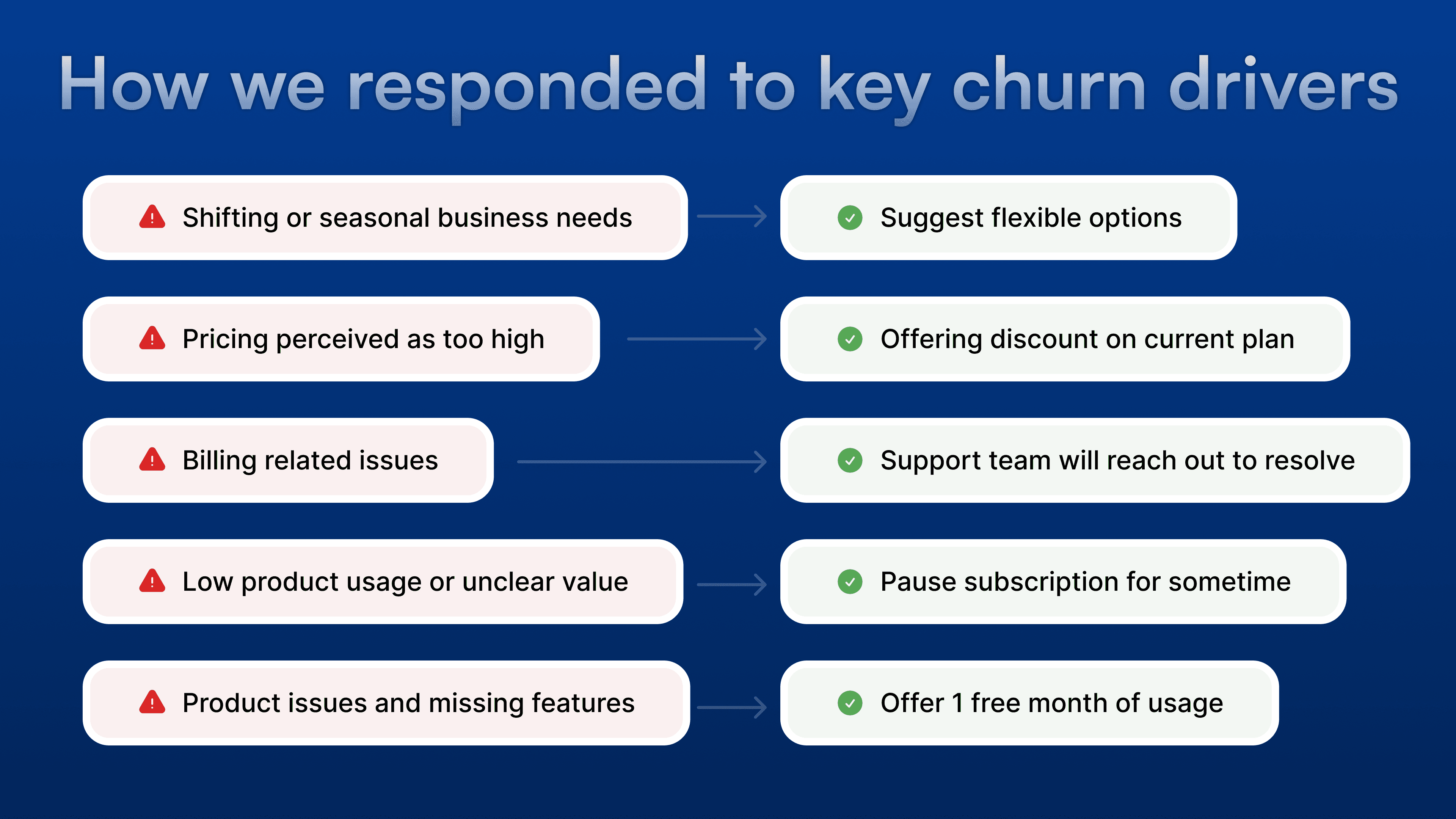
Decision logic
Mapping cancellation reasons to appropriate responses
Each cancellation reason reflects a different user intent. We mapped these intents to tailored, non-blocking responses thereby prioritizing flexibility where recovery was possible and clarity where it wasn’t.
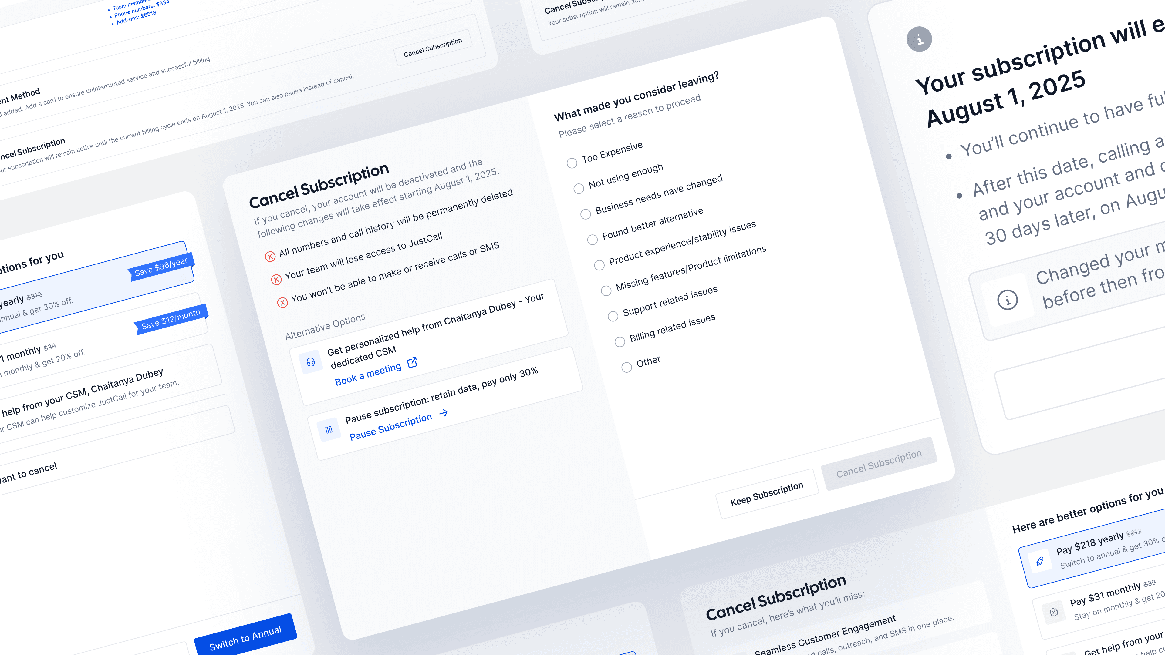
Existing cancellation experience
A lengthy and unclear cancellation journey
The cancellation flow was lengthy and confusing: The earlier flow had multiple redundant steps, scattered messaging, and no clear sense of progression which was making it feel unnecessarily long and slightly manipulative. Users often felt stuck instead of guided.
Updated high-level cancellation flow
Reducing number of clicks to cancel from 7 to just 5
To simplify the experience and make it more transparent, we redesigned the entire cancellation journey into a short, guided flow that lets users reach a decision faster without unnecessary friction or confusion.
the solution
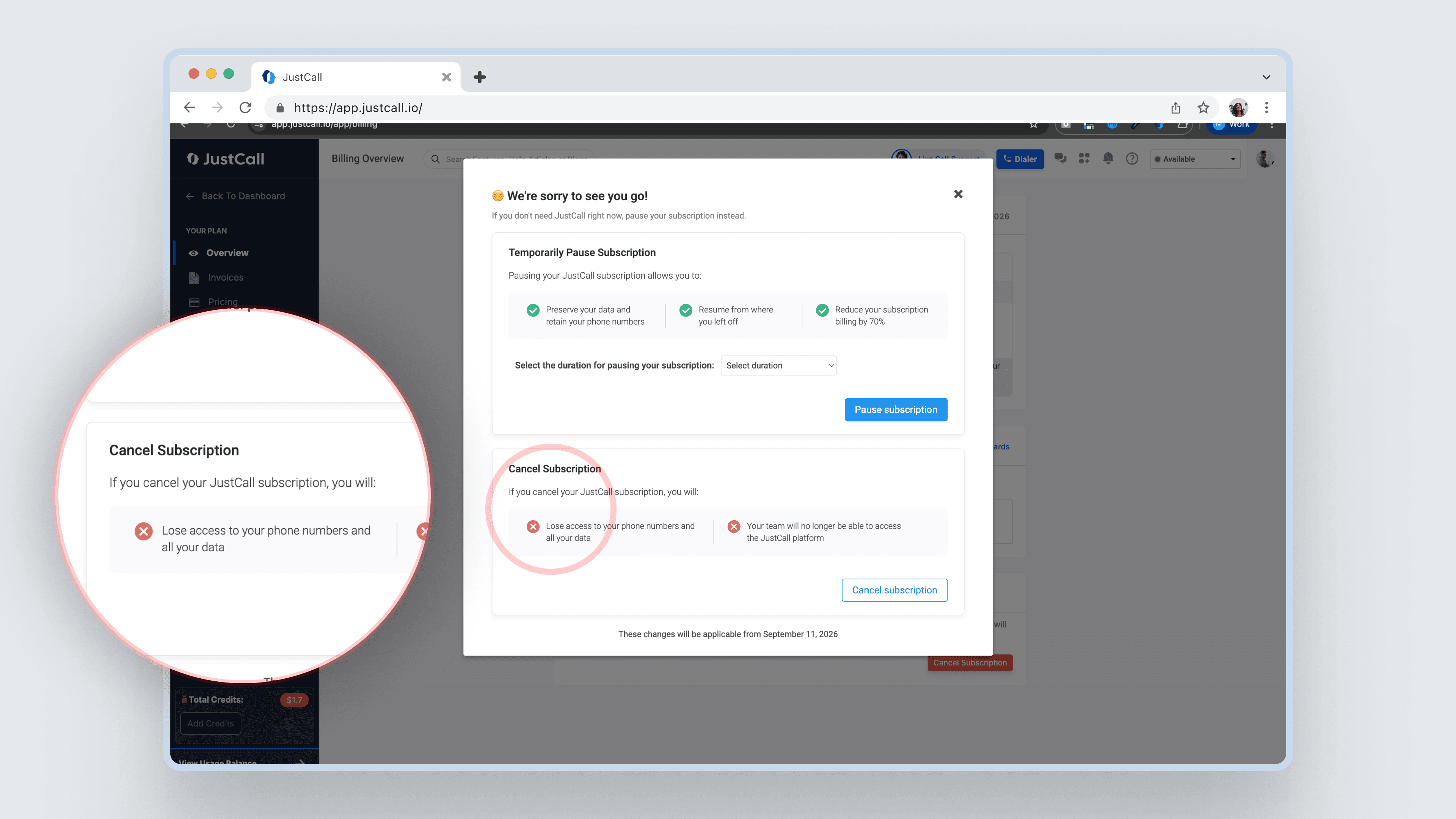
Before: Critical information buried and hard to scan
In the earlier experience, key information about data loss, feature deactivation, and account shutdown was scattered across the flow and visually de-emphasized.
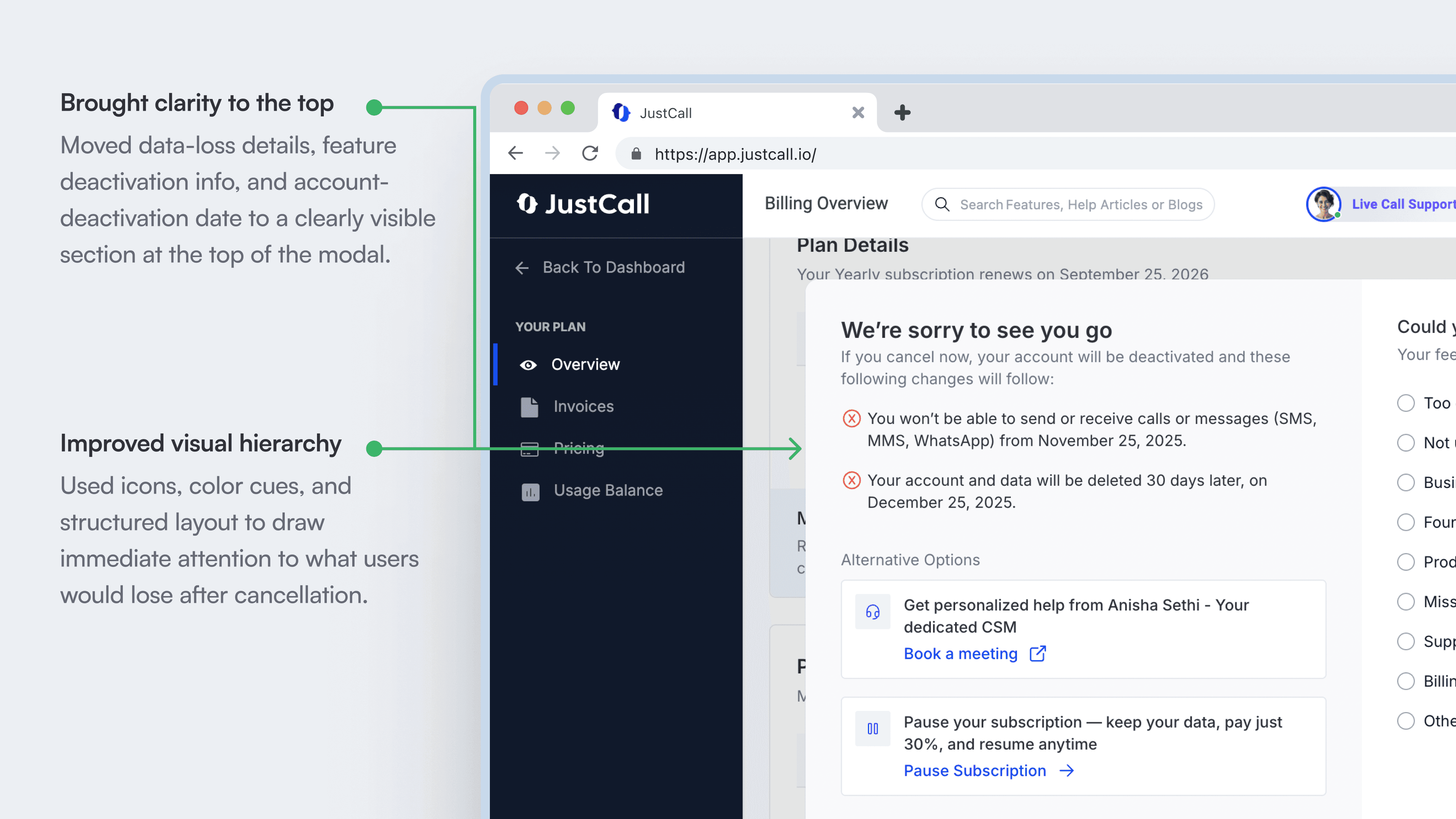
After: Clear, upfront communication of impact
We brought clarity to the top of the experience by surfacing all irreversible consequences like data loss, feature deactivation, and account timelines — in a single, clearly visible section.
Before: A frustrating and unclear reason selection experience
Selecting a cancellation reason was a frustrating step for users. Broad, overlapping options forced users to approximate their intent rather than accurately express it.
After: Clear, intent-driven reason selection
We redesigned reason selection to reduce frustration by making each option specific, mutually exclusive, and easy to understand.
Before: No reminder of the value users had built
The earlier cancellation flow focused purely on functional steps like cancel, confirm, and exit, without acknowledging the value users had accumulated while using JustCall.
While reviewing cancellation experiences across other products, we noticed a recurring pattern: before letting users go, many products surfaced a clear reminder of the value users had already built or the capabilities they would forfeit.
How other products drive retention
We reviewed how mature SaaS and adjacent products handle high-intent cancellation moments, focusing on how they surface intent, offer flexibility, and preserve user trust without adding friction.
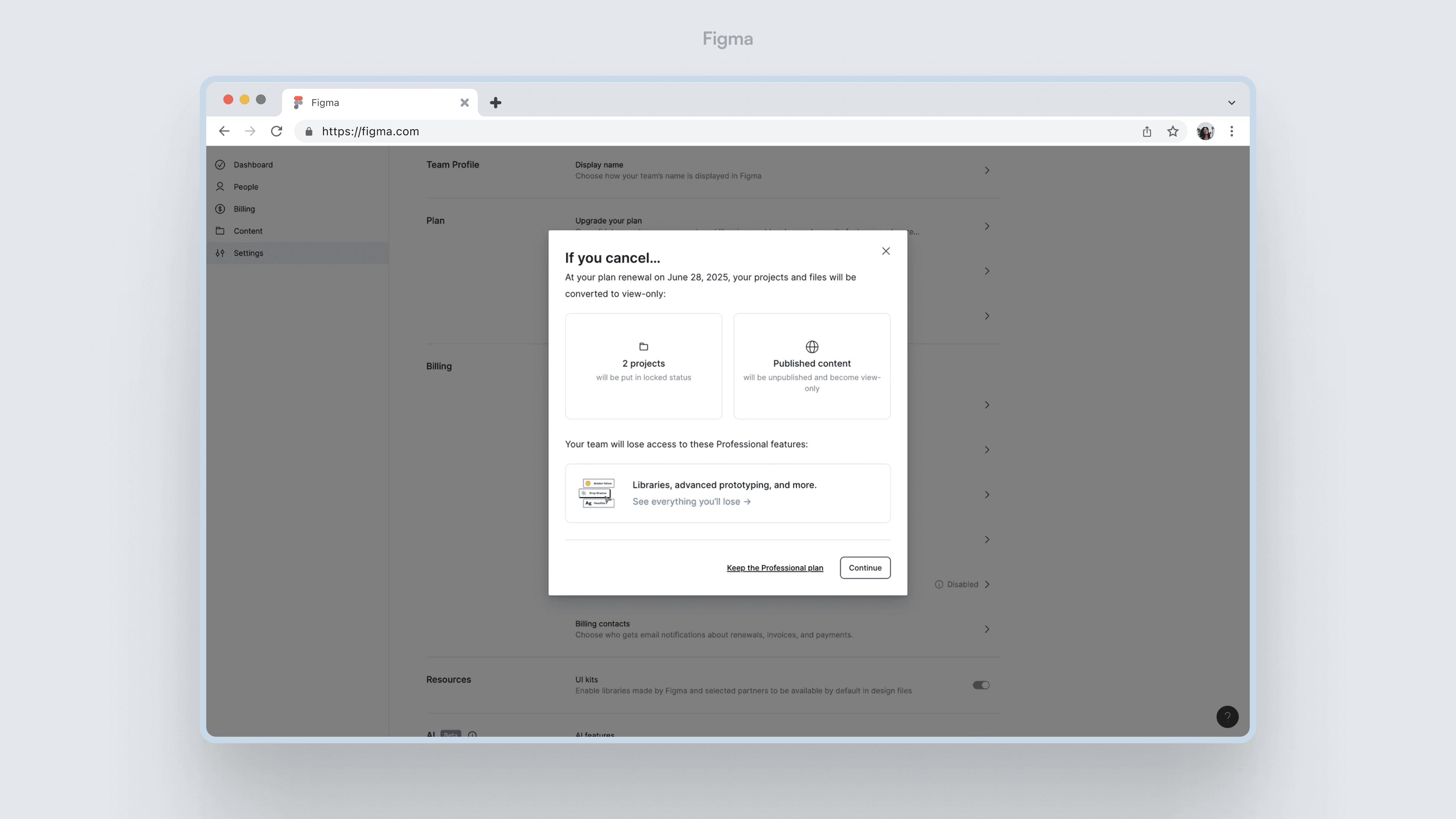
Figma
Reminds users of their existing files, published projects, and shared assets before deletion which makes them realize what will be affected.
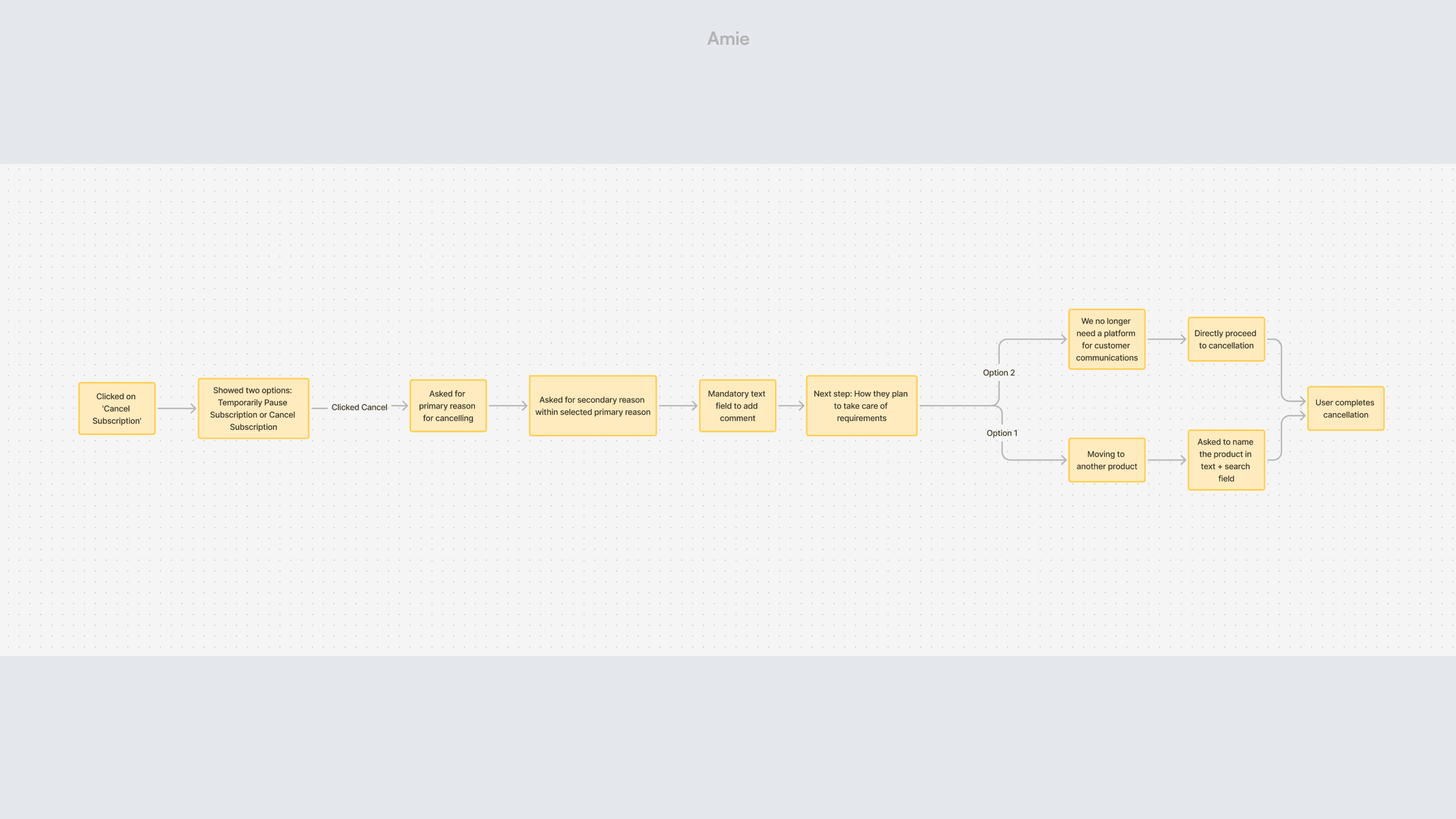
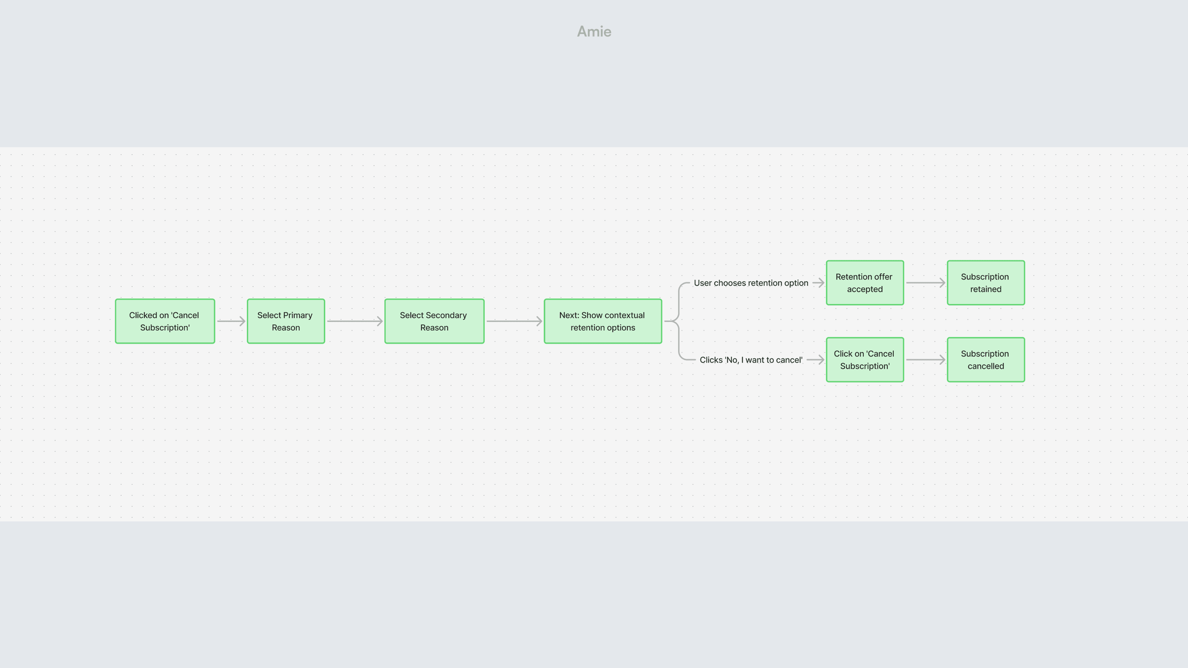
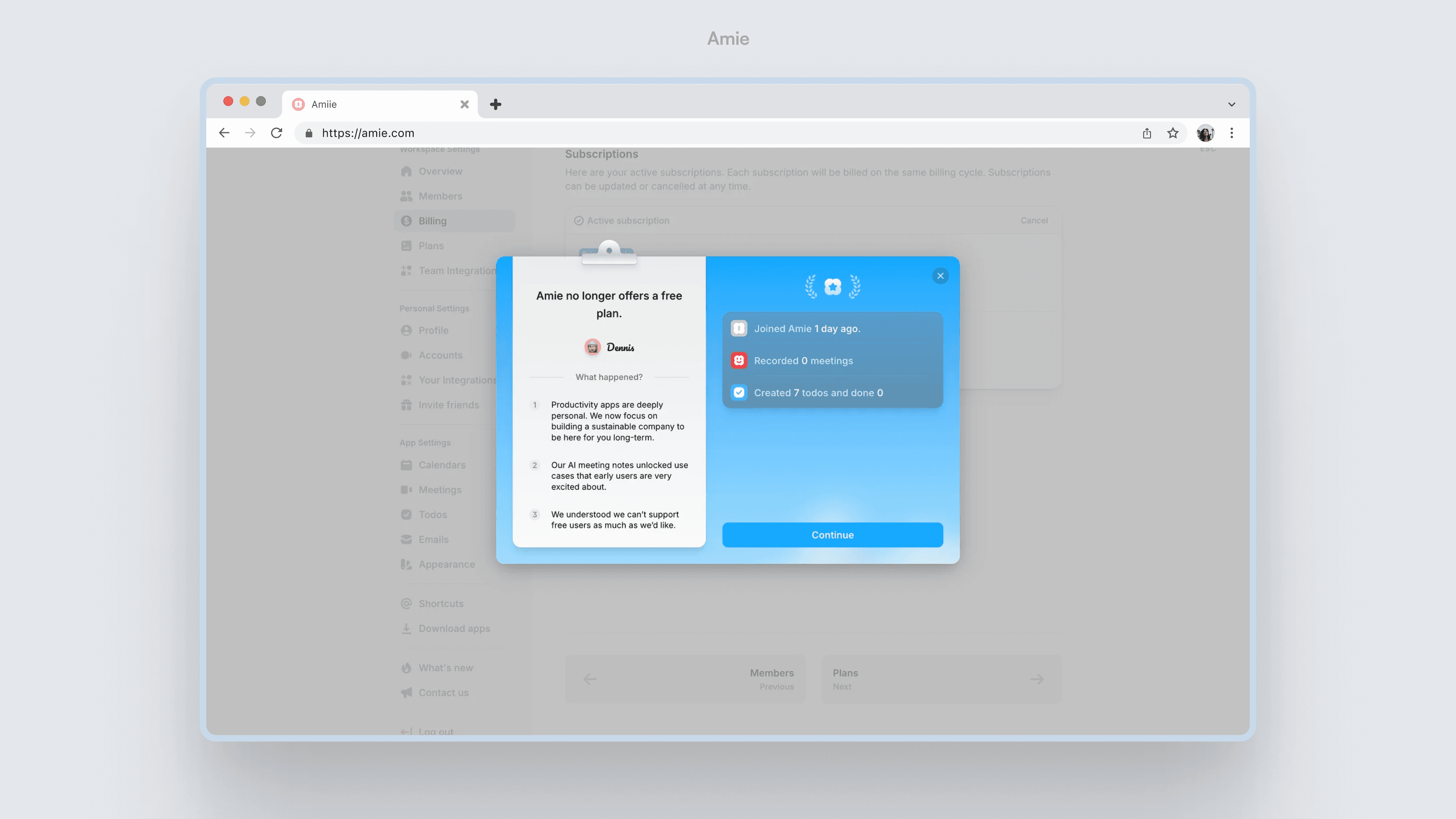
Amie
Highlights new and existing features, along with a summary of how the user has been using the product - like total recorded meetings or completed tasks.
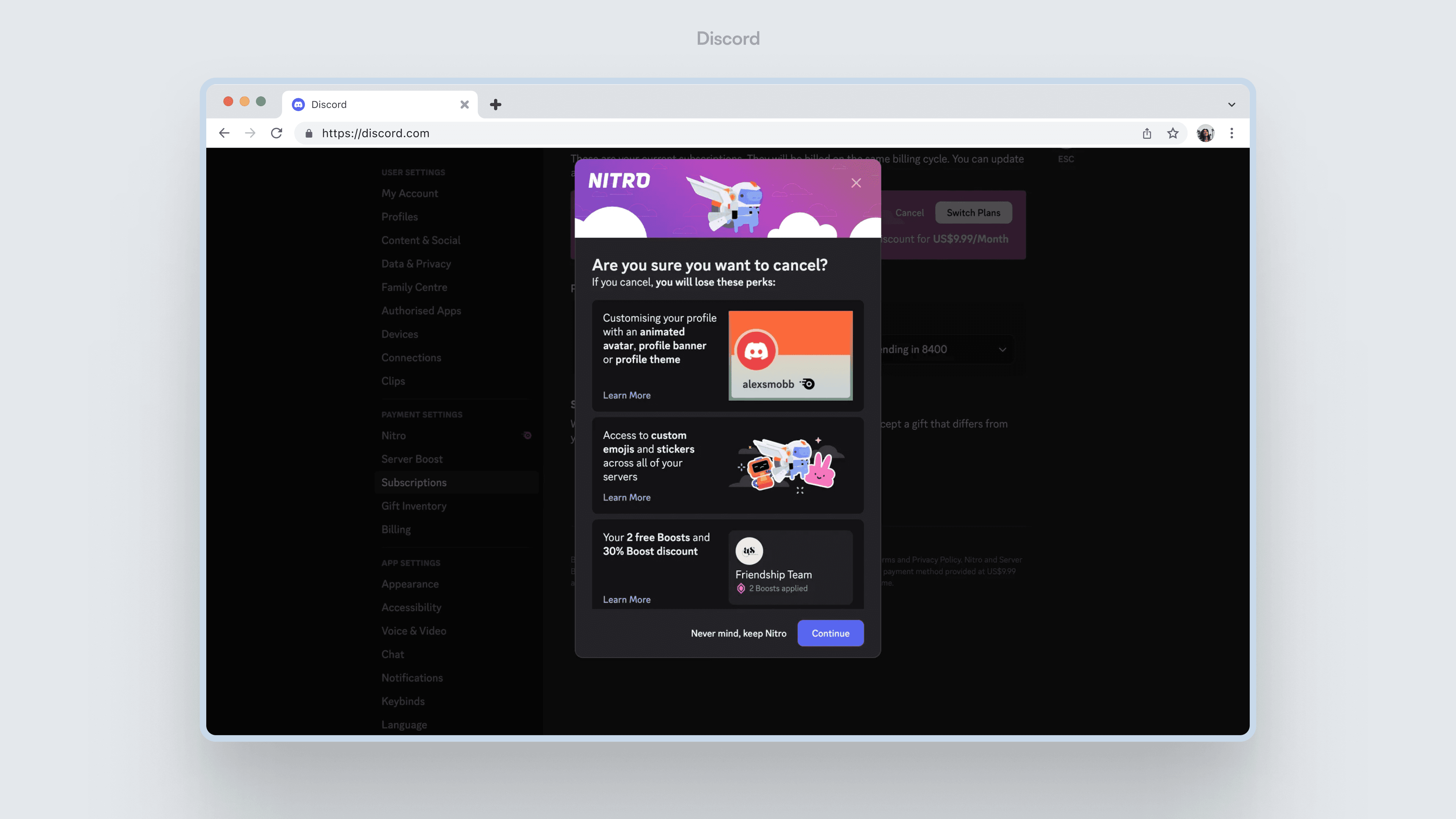
Discord
Shows exactly what perks will be lost post-cancellation, such as profile customization, emojis, and higher upload limits.
After: Making value explicit, without adding friction
In the first iteration, we focused on transparency by clearly listing the key features and capabilities users would lose after cancellation

Planned improvement (Phase 2)
The next step is to personalize this experience further by surfacing usage-based metrics such as total calls handled, messages sent, or hours spent on calls, helping users reflect on the tangible value created during their time with JustCall.

Before: A single, rigid retention option
In the earlier cancellation flow, the only alternative offered to users was a generic pause subscription option regardless of why they were cancelling.
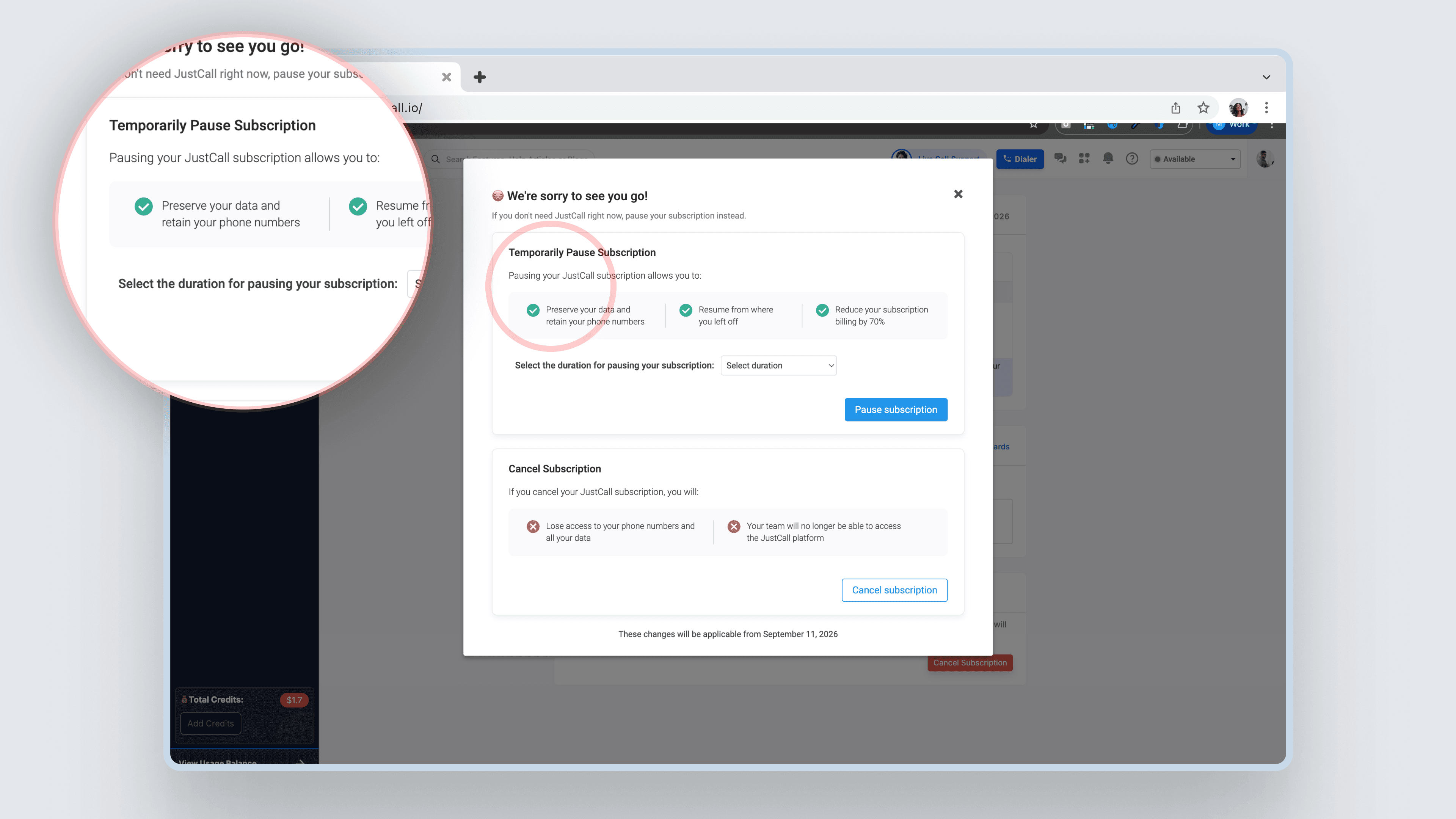
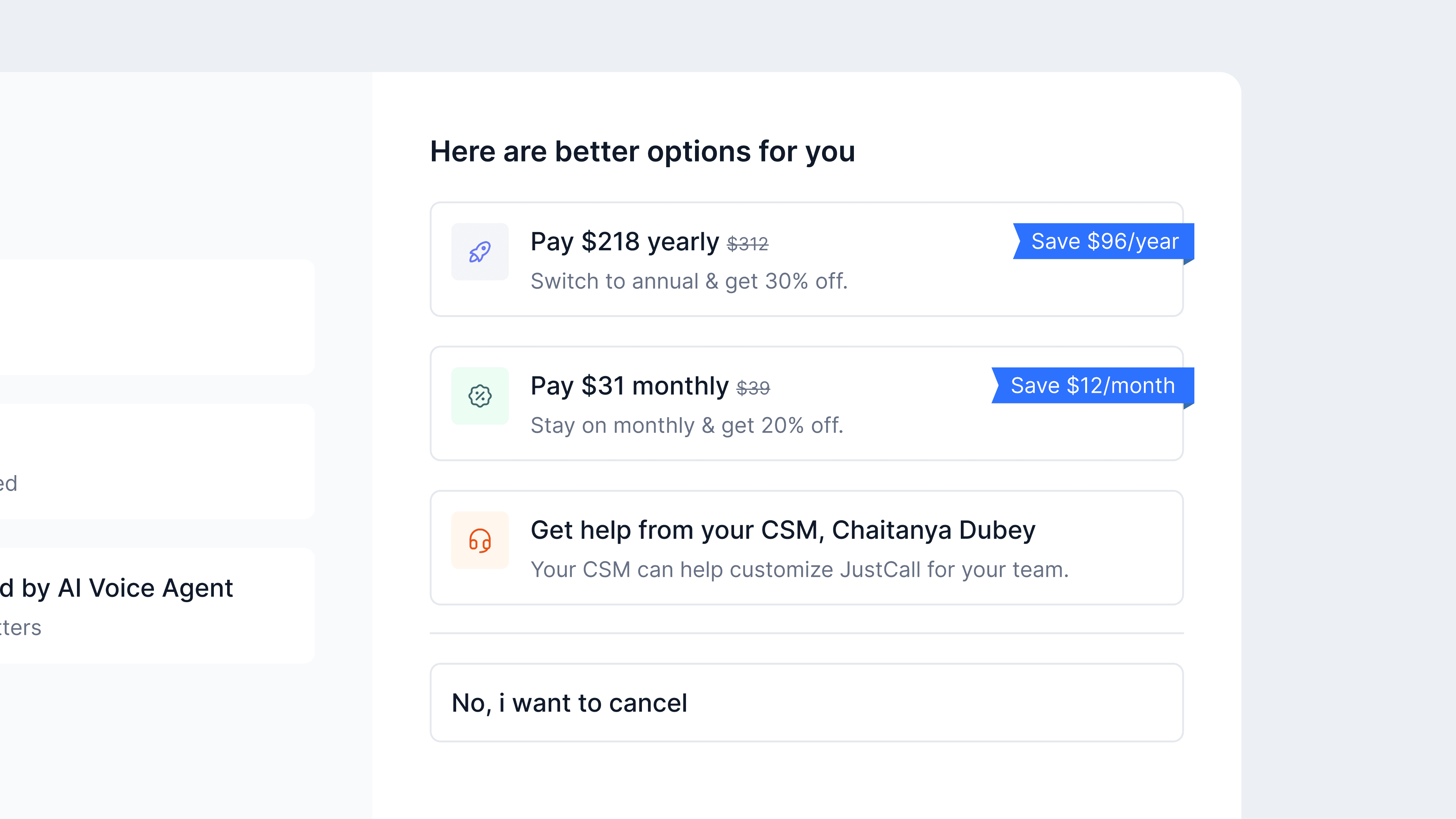
After: Multiple, cancellation reason based alternatives
We expanded retention beyond a single pause option by introducing multiple alternatives tailored to the user’s cancellation intent.
Extras
Billing Page Loader
To make waiting states more brand-aligned, I designed a custom loader animation for the billing page.
Free trial ended state
A simple GIF was added to clearly communicate the free-trial-ended state.

Final design
The redesigned cancellation experience
A shorter, intent-aware cancellation flow that prioritises clarity, transparency, and respectful retention.
Impact
The updated cancellation flow began showing early signals of reduced churn and improved visibility into why users were leaving.
32% ↓
Cancelled companies dropped from ~81 to ~55 per week after the rollout, indicating a downward trend despite
short-term volatility.
20% ↓
Weekly cancelled MRR declined significantly compared to pre-change levels, with one rebound week highlighting the need for continued monitoring.
26–28%
Roughly a quarter of users who initiate cancellation drop off before completing it, with the biggest drop between reason selection and final confirmation.
Conclusion
Reflections and takeaways
This project involved a lot of exploration and discussion. If I had to distill the learnings, these are the key ones.
Ethical retention over friction
Learned how to avoid dark patterns and design cancellation flows that stay transparent, compliant, and user-first.
Balancing business and user freedom
Understood how to support retention goals while still making cancellation clear, honest, and easy.
Design as trust,
not just UI
This project reinforced that good design is about structure, clarity, and trust and not just screens or flows.